A histogram chart is a graphical representation of data distribution, where values are grouped into ranges (bins) and displayed as bars. Unlike bar charts, which compare discrete categories, histograms show the frequency of continuous data, making them ideal for understanding patterns, trends, and variations in datasets.
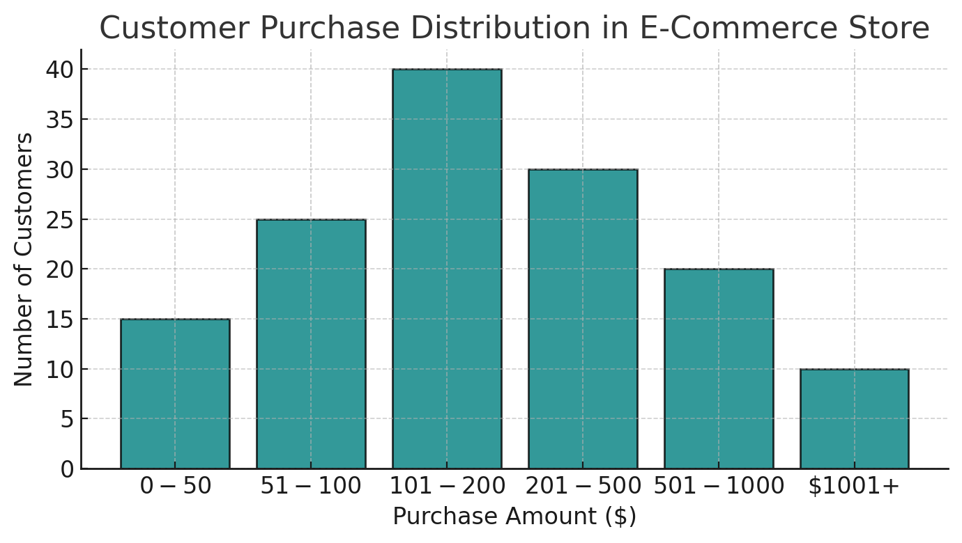
Histograms are widely used in business, finance, healthcare, and statistics to analyze numerical data. For example, an e-commerce company analyzing customer purchase amounts can use a histogram to see how frequently customers spend within specific price ranges (e.g., $0-$50, $50-$100, $100-$150). This helps businesses identify spending patterns and adjust pricing strategies accordingly.
By converting raw numerical data into an intuitive visual format, histograms allow analysts to detect patterns that might be difficult to identify in raw datasets. Whether assessing sales trends, inventory demand, or financial transactions, histograms play a crucial role in interpreting numerical information effectively.
Anatomy of a Histogram Chart
A histogram chart consists of several key components that work together to visually represent the distribution of numerical data. Understanding these elements helps in correctly interpreting and utilizing histograms in data analysis.
Data
The foundation of any histogram is raw numerical data, collected from various sources such as surveys, financial reports, or experimental results. This data is then grouped into intervals (bins) to create the histogram. The more comprehensive the dataset, the more accurate the representation of its distribution.
Bins (Class Intervals)
Bins, also known as class intervals, divide data into predefined ranges. Each bin represents a range of values, and the number of bins affects the level of detail in the histogram. Too many bins can make the histogram look noisy, while too few bins may oversimplify the distribution.
Frequency (or Density)
The frequency of a bin refers to the number of data points that fall within that range. Higher bars indicate more data points in a particular interval, showing the most common values in a dataset.
Axes
- X-Axis (Horizontal Axis): Represents the data intervals (bins).
- Y-Axis (Vertical Axis): Represents the frequency or density of values in each bin.
Shape
Histograms can take different shapes, including normal (bell-shaped), skewed, uniform, bimodal, or multimodal distributions. The shape provides insights into data trends, variability, and symmetry.
When Should a Histogram Be Used?
Histograms are particularly useful in data analysis and visualization when working with continuous numerical data. They help identify patterns, trends, and anomalies in datasets. Here are three key scenarios where histograms are most effective:
When Data Has a Single Independent Variable
Histograms are ideal when analyzing datasets with one continuous variable. For example, if a company wants to examine the distribution of employee salaries, a histogram can group salary ranges into bins and show how frequently salaries fall within those ranges.
When Data Has a Continuous Range
Unlike bar charts, which compare categorical data, histograms are used when data falls within a continuous numerical range. For example, in temperature analysis, a histogram can display how frequently different temperature ranges occur over a year, providing insights into seasonal variations.
When Comparing Two Datasets
Histograms can be used to compare two distributions by overlaying multiple histograms or placing them side by side. For instance, in healthcare, comparing histograms of blood pressure readings for two patient groups can reveal differences in health conditions and risk factors.
Main Uses of Histogram Charts
Histogram charts serve as essential tools in data analysis by providing insights into the distribution and characteristics of numerical data. They help analysts identify patterns, trends, and outliers, making them widely used across various industries.
Analyzing Frequency Distribution
One of the primary uses of histograms is to visualize how frequently different data values occur within a dataset. For example, a company analyzing customer ages can use a histogram to determine the most common age groups, helping in targeted marketing and product development.
Analyzing Data Symmetry
Histograms help detect whether a dataset is symmetrically distributed or skewed. If a histogram has a bell-shaped curve, it suggests a normal distribution. A right-skewed histogram (tail on the right) indicates that most data points are clustered on the lower end, while a left-skewed histogram suggests the opposite. These insights are crucial in statistical modeling and decision-making.
Analyzing Change Over Time
Histograms can also be used in trend analysis by comparing frequency distributions over different time periods. For example, in finance, businesses use histograms to study stock price fluctuations or sales patterns over months or years, helping them predict future trends and adjust strategies accordingly.
How to Create a Histogram Chart – Step-by-Step Guide
Creating a histogram chart involves a structured process to accurately visualize data distribution. Below are the key steps to build a histogram effectively:
Step 1: Data Collection
The first step is to gather raw numerical data. This could be collected from sources like surveys, databases, financial records, or experimental observations. The dataset should be relevant, complete, and representative of the population being analyzed.
Step 2: Data Preparation
Before visualization, data must be cleaned and structured. This includes handling missing values, removing duplicates, and ensuring numerical consistency. Well-prepared data prevents misleading histogram representations.
Step 3: Define the Number of Bins
Choosing the right number of bins (class intervals) is crucial. Too few bins can oversimplify the data, while too many can introduce unnecessary noise. The Sturges’ rule is a common method for determining the optimal number of bins:
$$k = 1 + \log_2(n)$$
where $k$ is the number of bins and $n$ is the number of observations.
Step 4: Calculate the Bin Width
Bin width is calculated using:
$$\text{Bin Width} = \frac{\text{Range of Data}}{\text{Number of Bins}}$$
where Range = Maximum Value – Minimum Value.
Step 5: Prepare the Frequency Table
Each data point is categorized into the appropriate bin, and the frequency (count) of occurrences is recorded. This table serves as the basis for plotting.
Step 6: Draw the Axes and Histogram Bars
- X-Axis: Represents bin intervals.
- Y-Axis: Represents frequency counts.
Each bin is drawn as a bar with no gaps, emphasizing continuous data.
Step 7: Refine and Interpret
After plotting, refine bin widths if needed and analyze the histogram to identify trends, skewness, or anomalies.
Best Practices When Using a Histogram
To ensure accurate and meaningful data visualization, it is essential to follow best practices when creating a histogram chart. Proper bin selection, axis scaling, and consistent formatting help in avoiding misinterpretations.
Using a Zero Baseline
Always set the Y-axis baseline to zero to accurately represent frequency counts. A non-zero baseline can distort the perception of differences between bins, leading to misleading conclusions about data distribution.
Choosing the Right Number of Bins
Selecting the correct number of bins is crucial to effectively capturing patterns in data. Too few bins oversimplify trends, while too many bins create noise. Methods like Sturges’ rule or the Freedman-Diaconis rule help determine an optimal bin count.
Using Equal Bin Sizes
Bins should be of equal width to ensure a fair comparison of frequency distributions. Unequal bin widths can distort interpretations, making one range appear more significant than another.
When Not to Use a Histogram Chart?
While histograms are powerful for visualizing numerical data, they are not suitable for all datasets. Using them in the wrong context can lead to misinterpretations and misleading insights.
When the Data is Non-Numeric
Histograms are designed for continuous numerical data, making them unsuitable for categorical data. For example, using a histogram to represent car brands, customer preferences, or survey responses would be incorrect. Instead, a bar chart should be used for categorical data.
When the Sample Size is Small
Histograms require sufficient data points to reveal meaningful patterns. With a small dataset, binning may not provide an accurate representation of the distribution, leading to misleading conclusions. In such cases, using a dot plot or box plot is more effective.
When There are Large Gaps in Data
If the dataset contains missing values or inconsistent binning, the histogram may misrepresent the distribution. A better approach in such cases is to impute missing values or use a different visualization like a scatter plot.
Related Charts and Alternatives to Histograms
While histograms are effective for visualizing data distributions, other chart types can provide additional insights depending on the data type and analysis requirements. Below are key alternatives:
Bar Charts
Unlike histograms, which display continuous numerical data, bar charts represent categorical data. The bars in a bar chart have gaps between them, whereas histogram bars are continuous. For example, a bar chart is suitable for showing the number of students in different majors, whereas a histogram is better for analyzing exam score distributions.
Box Plots
Box plots, also known as box-and-whisker plots, provide a summary of data distribution through quartiles, median, and outliers. While histograms display frequency distributions, box plots highlight skewness, spread, and extreme values in datasets, making them useful for comparing multiple distributions.
Density Plots
A density plot is a smoothed version of a histogram that uses kernel density estimation (KDE) to represent data distributions. Unlike histograms, which rely on bin sizes, density plots provide a continuous representation of the probability distribution.
Scatter Plots
While histograms show single-variable distributions, scatter plots display relationships between two numerical variables. They are useful for identifying correlations and trends in datasets, such as the relationship between study time and test scores.
Conclusion
A histogram chart is a fundamental tool for visualizing data distributions, helping analysts identify patterns, trends, and anomalies. By grouping data into bins and representing frequencies, histograms provide insights into data variability, skewness, and central tendencies.
Histograms are widely used in statistics, business intelligence, healthcare, and finance, making them indispensable for data-driven decision-making. Choosing the right bin size and following best practices ensures accurate interpretations.
As big data analytics evolves, histograms will continue to play a key role in machine learning, predictive modeling, and real-time data processing, reinforcing their value in modern data science.
Read More:
References: